ggplot2 Layers
library(tidyverse)
library(ggplot2)
1 Introduction
The layered structure of ggplot2 encourages you to design and construct graphics in a structured manner. It is useful to think about the purpose of each layer before it is added. In general, there are three purposes for a layer:
To display the data. We plot the raw data for many reasons, relying on our skills at pattern detection to spot gross structure, local structure, and outliers. This layer appears on virtually every graphic. In the earliest stages of data exploration, it is often the only layer.
To display a statistical summary of the data. As we develop and explore models of the data, it is useful to display model predictions in the context of the data. Showing the data helps us improve the model, and showing the model helps reveal subtleties of the data that we might otherwise miss. Summaries are usually drawn on top of the data.
To add additional metadata: context, annotations, and references. A metadata layer displays background context, annotations that help to give meaning to the raw data, or fixed references that aid comparisons across panels. Metadata can be useful in the background and foreground.
2 Geometric objects
How are these two plots similar?
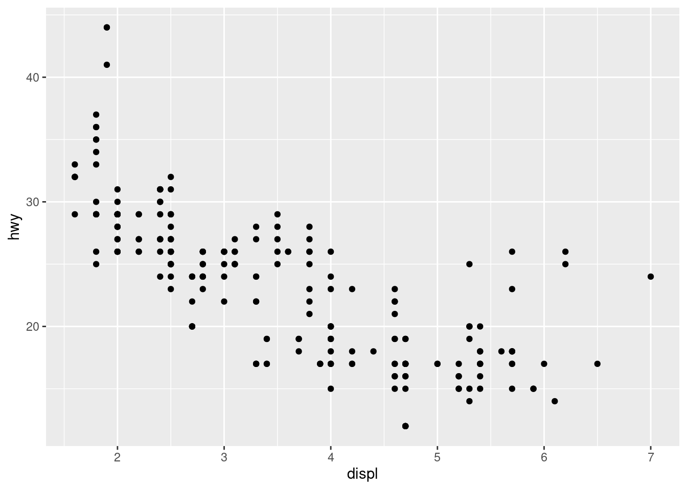

Both plots contain the same x variable, the same y variable, and both describe the same data. But the plots are not identical. Each plot uses a different visual object to represent the data. In ggplot2 syntax, we say that they use different geoms.
A geom is the geometrical object that a plot uses to represent data. People often describe plots by the type of geom that the plot uses. For example, bar charts use bar geoms, line charts use line geoms, boxplots use boxplot geoms, and so on. Scatterplots break the trend; they use the point geom. As we see above, you can use different geoms to plot the same data. The plot on the left uses the point geom, and the plot on the right uses the smooth geom, a smooth line fitted to the data.
To change the geom in your plot, change the geom function that you add to ggplot(). For instance, to make the plots above, you can use this code:
# left
ggplot(data = mpg) +
  geom_point(mapping = aes(x = displ, y = hwy))

# right
ggplot(data = mpg) +
  geom_smooth(mapping = aes(x = displ, y = hwy))
Every geom function in ggplot2 takes a mapping argument. However, not every aesthetic works with every geom. You could set the shape of a point, but you couldn’t set the “shape” of a line. On the other hand, you could set the linetype of a line. geom_smooth() will draw a different line, with a different linetype, for each unique value of the variable that you map to linetype.
ggplot(data = mpg) +
  geom_smooth(mapping = aes(x = displ, y = hwy, linetype = drv))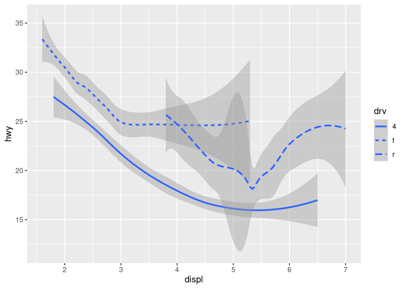
Here geom_smooth() separates the cars into three lines based on their drv value, which describes a car’s drivetrain. One line describes all of the points with a 4 value, one line describes all of the points with an f value, and one line describes all of the points with an r value. Here, 4 stands for four-wheel drive, f for front-wheel drive, and r for rear-wheel drive.
If this sounds strange, we can make it more clear by overlaying the lines on top of the raw data and then coloring everything according to drv.
ggplot(data = mpg, mapping = aes(x = displ, y = hwy, color = drv)) +
  geom_point() +
  geom_smooth(mapping = aes(linetype = drv))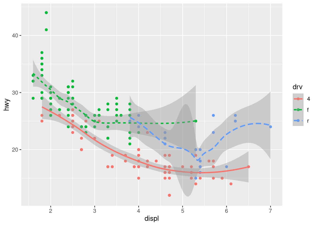
Notice that this plot contains two geoms in the same graph! If this makes you excited, buckle up. We will learn how to place multiple geoms in the same plot very soon.
ggplot2 provides over 40 geoms, and extension packages provide even more (see https://exts.ggplot2.tidyverse.org/gallery/ for a sampling). The best way to get a comprehensive overview is the ggplot2 cheatsheet, which you can find at https://www.rstudio.com/resources/cheatsheets/. To learn more about any single geom, use help: ?geom_smooth.
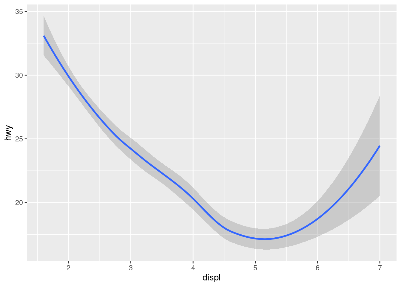
Many geoms, like geom_smooth(), use a single geometric object to display multiple rows of data. For these geoms, you can set the group aesthetic to a categorical variable to draw multiple objects. ggplot2 will draw a separate object for each unique value of the grouping variable. In practice, ggplot2 will automatically group the data for these geoms whenever you map an aesthetic to a discrete variable (as in the linetype example). It is convenient to rely on this feature because the group aesthetic by itself does not add a legend or distinguishing features to the geoms.
ggplot(data = mpg) +
  geom_smooth(mapping = aes(x = displ, y = hwy))

ggplot(data = mpg) +
  geom_smooth(mapping = aes(x = displ, y = hwy, group = drv))

ggplot(data = mpg) +
  geom_smooth(
    mapping = aes(x = displ, y = hwy, color = drv),
    show.legend = FALSE
  )
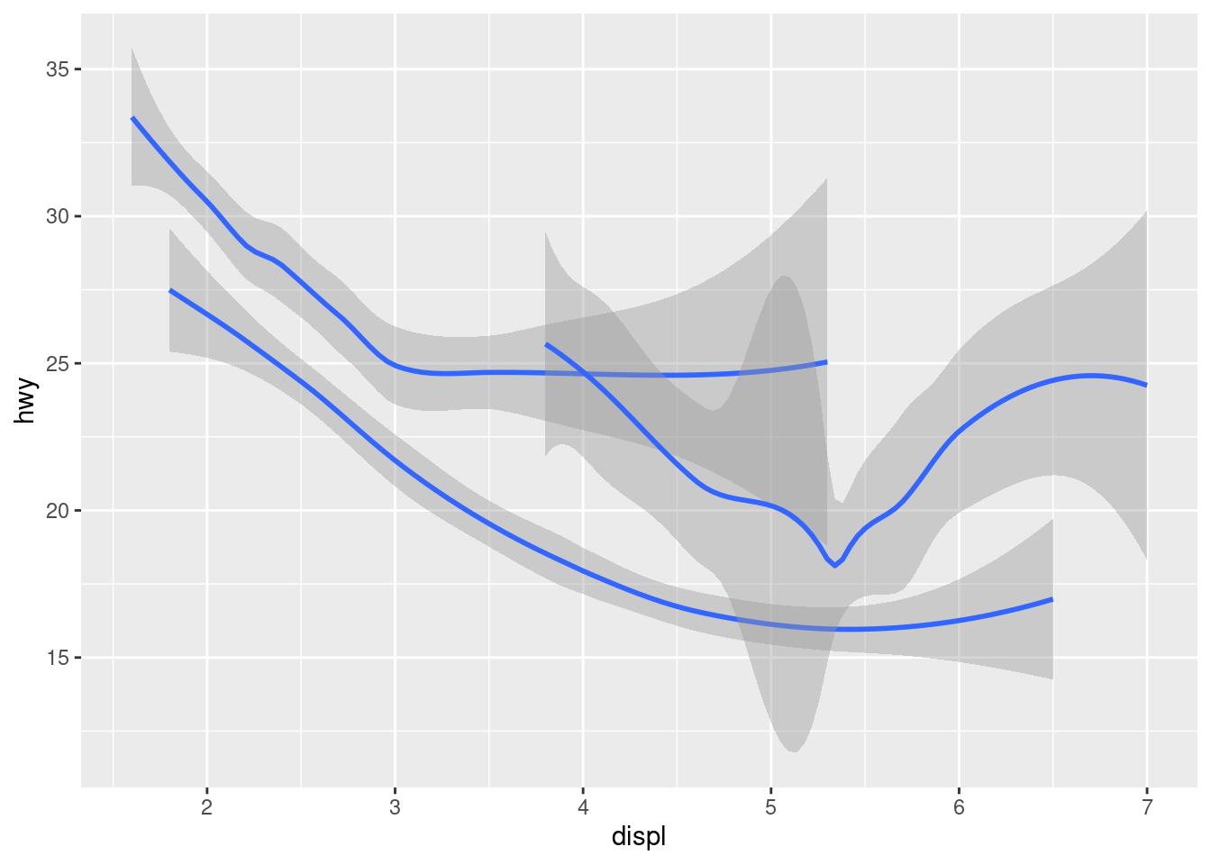
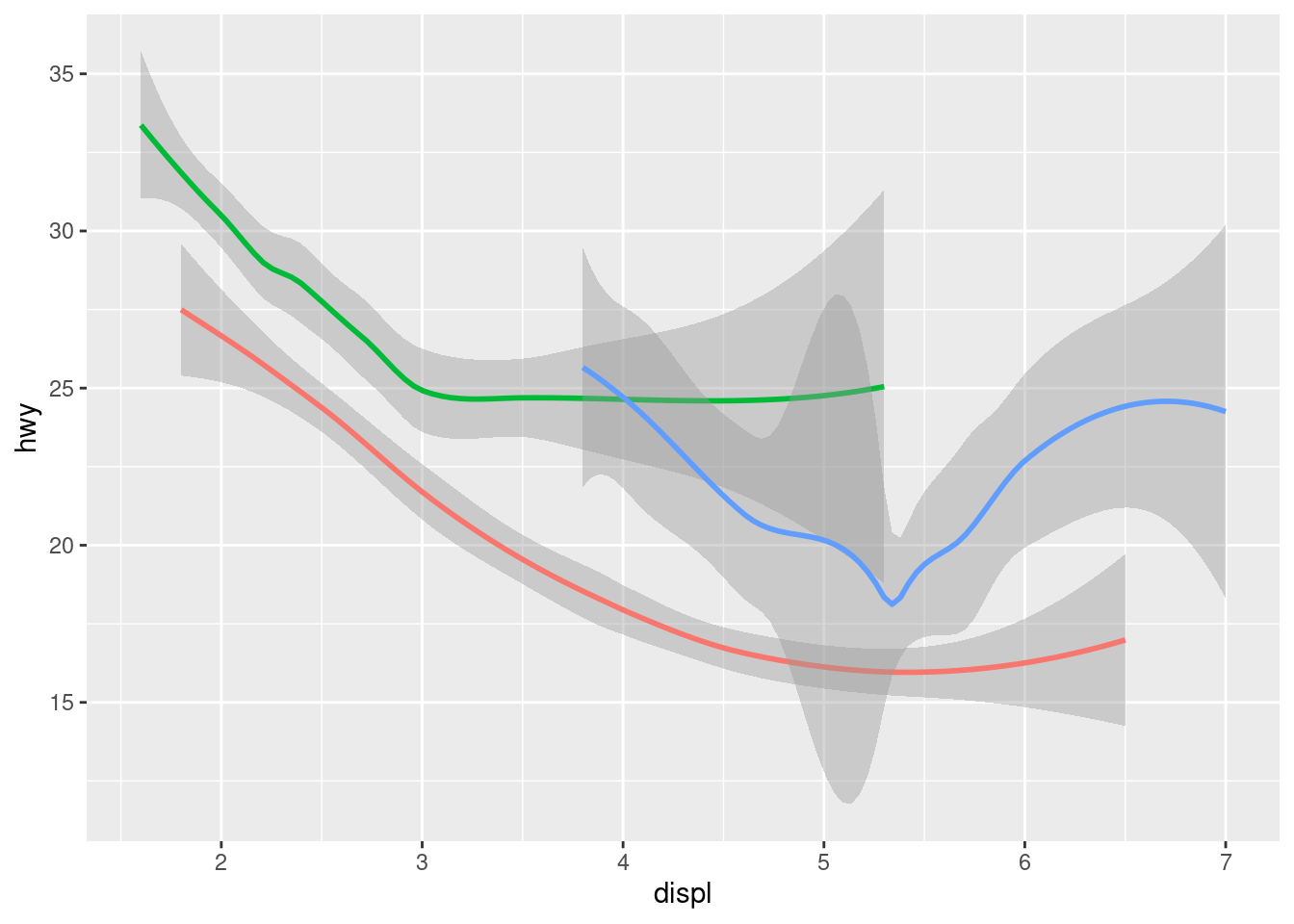
To display multiple geoms in the same plot, add multiple geom functions to ggplot():
ggplot(data = mpg) +
  geom_point(mapping = aes(x = displ, y = hwy)) +
  geom_smooth(mapping = aes(x = displ, y = hwy))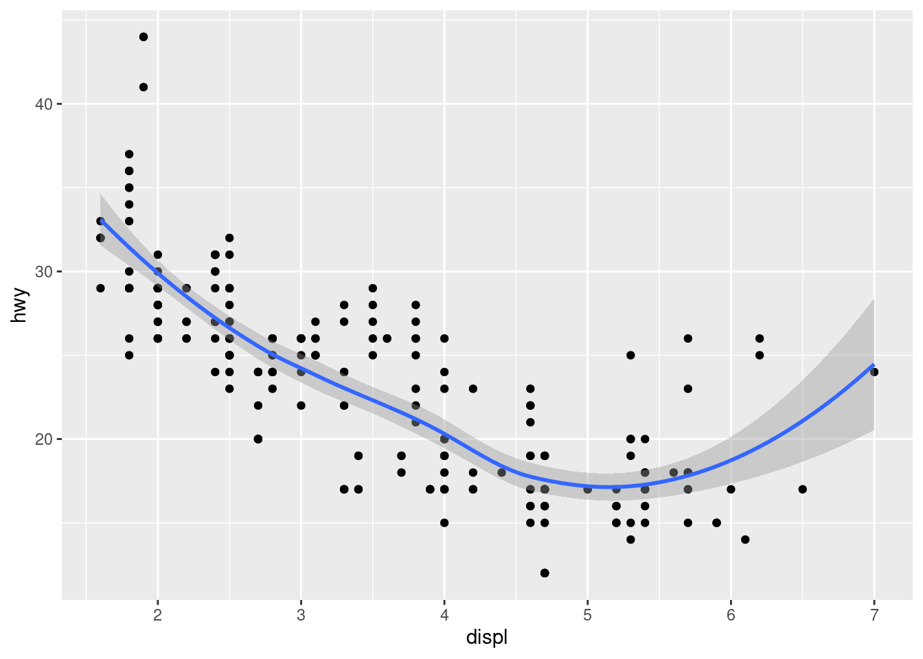
This, however, introduces some duplication in our code. Imagine if you wanted to change the y-axis to display cty instead of hwy. You’d need to change the variable in two places, and you might forget to update one. You can avoid this type of repetition by passing a set of mappings to ggplot(). ggplot2 will treat these mappings as global mappings that apply to each geom in the graph. In other words, this code will produce the same plot as the previous code:
ggplot(data = mpg, mapping = aes(x = displ, y = hwy)) +
  geom_point() +
  geom_smooth()
If you place mappings in a geom function, ggplot2 will treat them as local mappings for the layer. It will use these mappings to extend or overwrite the global mappings for that layer only. This makes it possible to display different aesthetics in different layers.
ggplot(data = mpg, mapping = aes(x = displ, y = hwy)) +
  geom_point(mapping = aes(color = class)) +
  geom_smooth()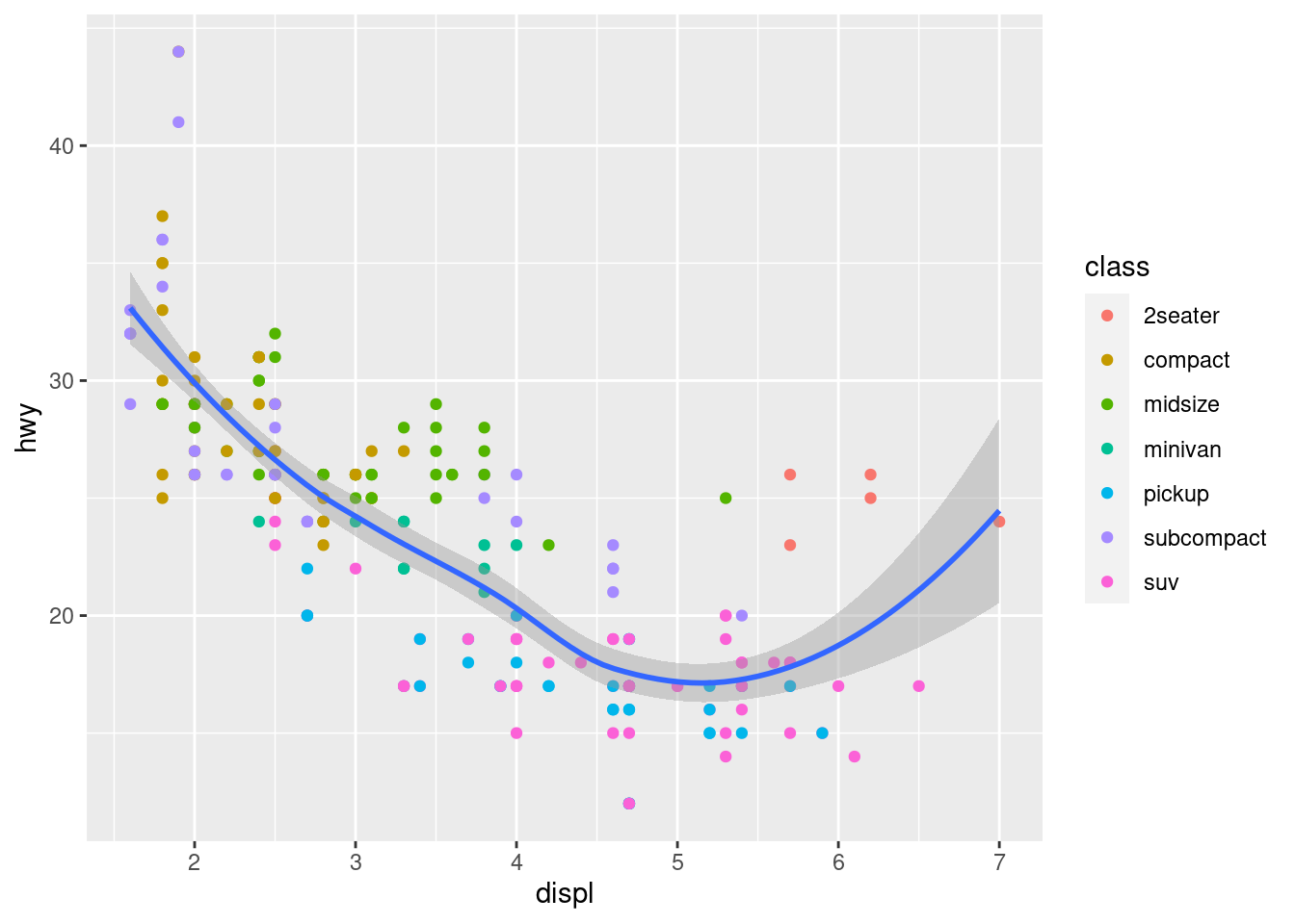
You can use the same idea to specify different data for each layer. Here, our smooth line displays just a subset of the mpg dataset, the subcompact cars. The local data argument in geom_smooth() overrides the global data argument in ggplot() for that layer only.
ggplot(data = mpg, mapping = aes(x = displ, y = hwy)) +
  geom_point(mapping = aes(color = class)) +
  geom_smooth(data = filter(mpg, class == "subcompact"), se = FALSE)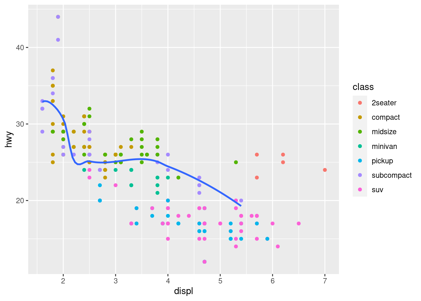
3 Statistical transformations
Next, let’s take a look at a bar chart. Bar charts seem simple, but they are interesting because they reveal something subtle about plots. Consider a basic bar chart, as drawn with geom_bar(). The following chart displays the total number of diamonds in the diamonds dataset, grouped by cut. The diamonds dataset comes in ggplot2 and contains information about ~54,000 diamonds, including the price, carat, color, clarity, and cut of each diamond. The chart shows that more diamonds are available with high quality cuts than with low quality cuts.
diamonds
#> # A tibble: 53,940 x 10
#>    carat cut       color clarity depth table price     x     y     z
#>    <dbl> <ord>     <ord> <ord>   <dbl> <dbl> <int> <dbl> <dbl> <dbl>
#>  1  0.23 Ideal     E     SI2      61.5    55   326  3.95  3.98  2.43
#>  2  0.21 Premium   E     SI1      59.8    61   326  3.89  3.84  2.31
#>  3  0.23 Good      E     VS1      56.9    65   327  4.05  4.07  2.31
#>  4  0.29 Premium   I     VS2      62.4    58   334  4.2   4.23  2.63
#>  5  0.31 Good      J     SI2      63.3    58   335  4.34  4.35  2.75
#>  6  0.24 Very Good J     VVS2     62.8    57   336  3.94  3.96  2.48
#>  7  0.24 Very Good I     VVS1     62.3    57   336  3.95  3.98  2.47
#>  8  0.26 Very Good H     SI1      61.9    55   337  4.07  4.11  2.53
#>  9  0.22 Fair      E     VS2      65.1    61   337  3.87  3.78  2.49
#> 10  0.23 Very Good H     VS1      59.4    61   338  4     4.05  2.39
#> # … with 53,930 more rows
ggplot(data = diamonds) +
  geom_bar(mapping = aes(x = cut))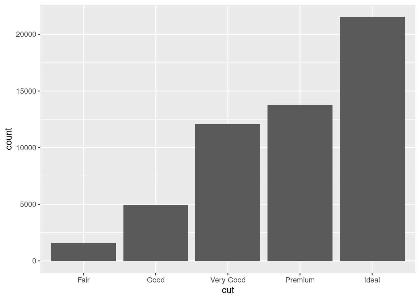
On the x-axis, the chart displays cut, a variable from diamonds. On the y-axis, it displays count, but count is not a variable in diamonds! Where does count come from? Many graphs, like scatterplots, plot the raw values of your dataset. Other graphs, like bar charts, calculate new values to plot:
bar charts, histograms, and frequency polygons bin your data and then plot bin counts, the number of points that fall in each bin.
smoothers fit a model to your data and then plot predictions from the model.
boxplots compute a robust summary of the distribution and then display a specially formatted box.
The algorithm used to calculate new values for a graph is called a stat, short for statistical transformation. The figure below describes how this process works with geom_bar().
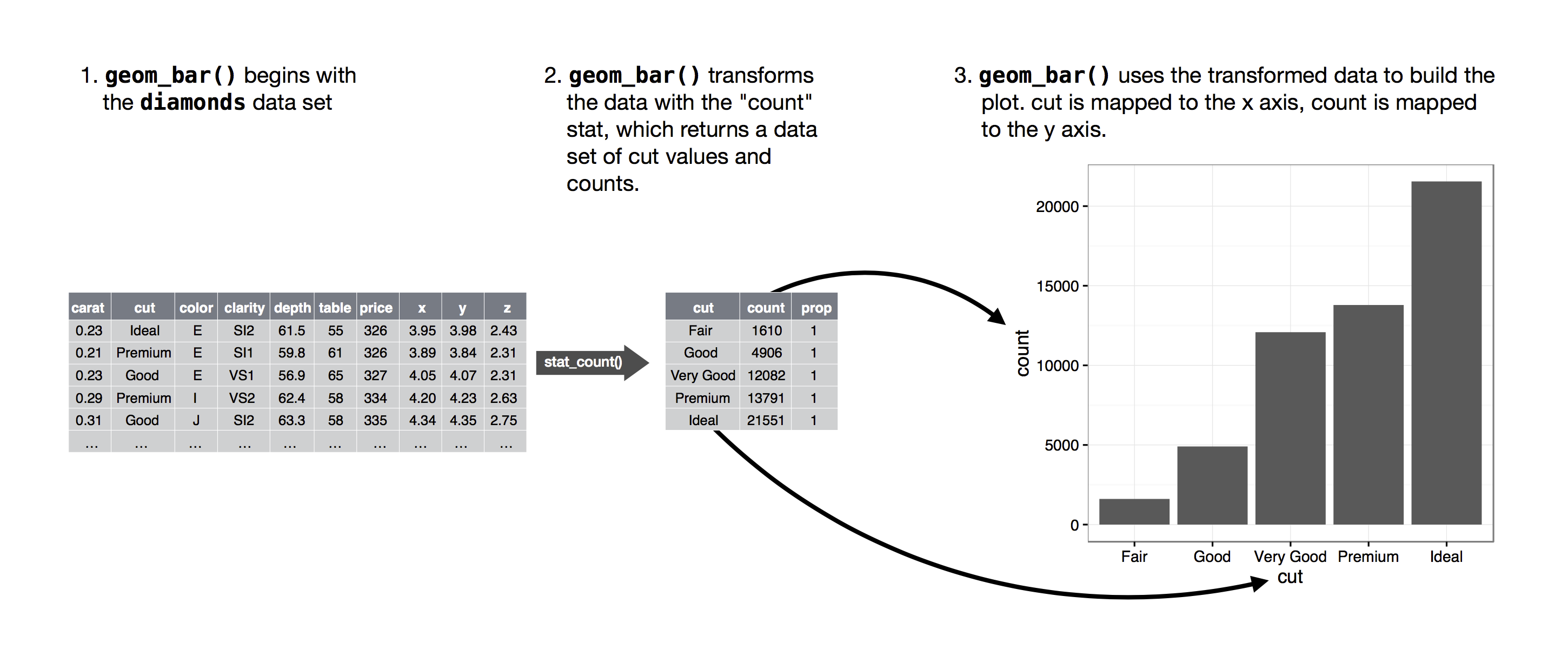
You can learn which stat a geom uses by inspecting the default value for the stat argument. For example, ?geom_bar shows that the default value for stat is “count”, which means that geom_bar() uses stat_count(). stat_count() is documented on the same page as geom_bar(), and if you scroll down you can find a section called “Computed variables”. That describes how it computes two new variables: count and prop.
You can generally use geoms and stats interchangeably. For example, you can recreate the previous plot using stat_count() instead of geom_bar():
ggplot(data = diamonds) +
  stat_count(mapping = aes(x = cut))
This works because every geom has a default stat; and every stat has a default geom. This means that you can typically use geoms without worrying about the underlying statistical transformation. There are three reasons you might need to use a stat explicitly:
You might want to override the default stat. In the code below, I change the stat of
geom_bar()from count (the default) to identity. This lets me map the height of the bars to the raw values of a \(y\) variable. Unfortunately when people talk about bar charts casually, they might be referring to this type of bar chart, where the height of the bar is already present in the data, or the previous bar chart where the height of the bar is generated by counting rows.demo <- tribble( ~cut, ~freq, "Fair", 1610, "Good", 4906, "Very Good", 12082, "Premium", 13791, "Ideal", 21551 ) ggplot(data = demo) + geom_bar(mapping = aes(x = cut, y = freq), stat = "identity")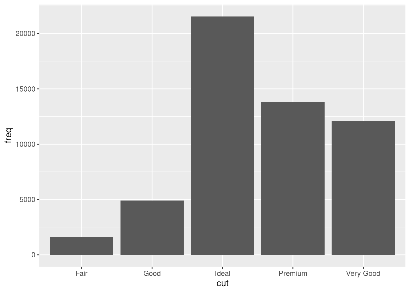
You might want to override the default mapping from transformed variables to aesthetics. For example, you might want to display a bar chart of proportion, rather than count:
ggplot(data = diamonds) +
  geom_bar(mapping = aes(x = cut, y = stat(prop), group = 1))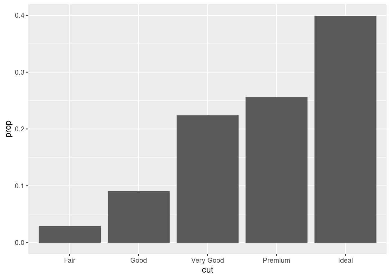
To find the variables computed by the stat, look for the help section titled “computed variables”.
You might want to draw greater attention to the statistical transformation in your code. For example, you might use
stat_summary(), which summarises the y values for each unique x value, to draw attention to the summary that you’re computing:ggplot(data = diamonds) + stat_summary( mapping = aes(x = cut, y = depth), fun.min = min, fun.max = max, fun = median )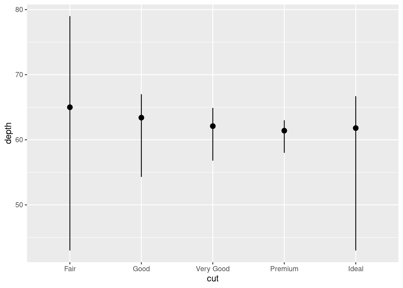
ggplot2 provides over 20 stats for you to use. Each stat is a function, so you can get help in the usual way, e.g. ?stat_bin. To see a complete list of stats, try the ggplot2 cheatsheet.